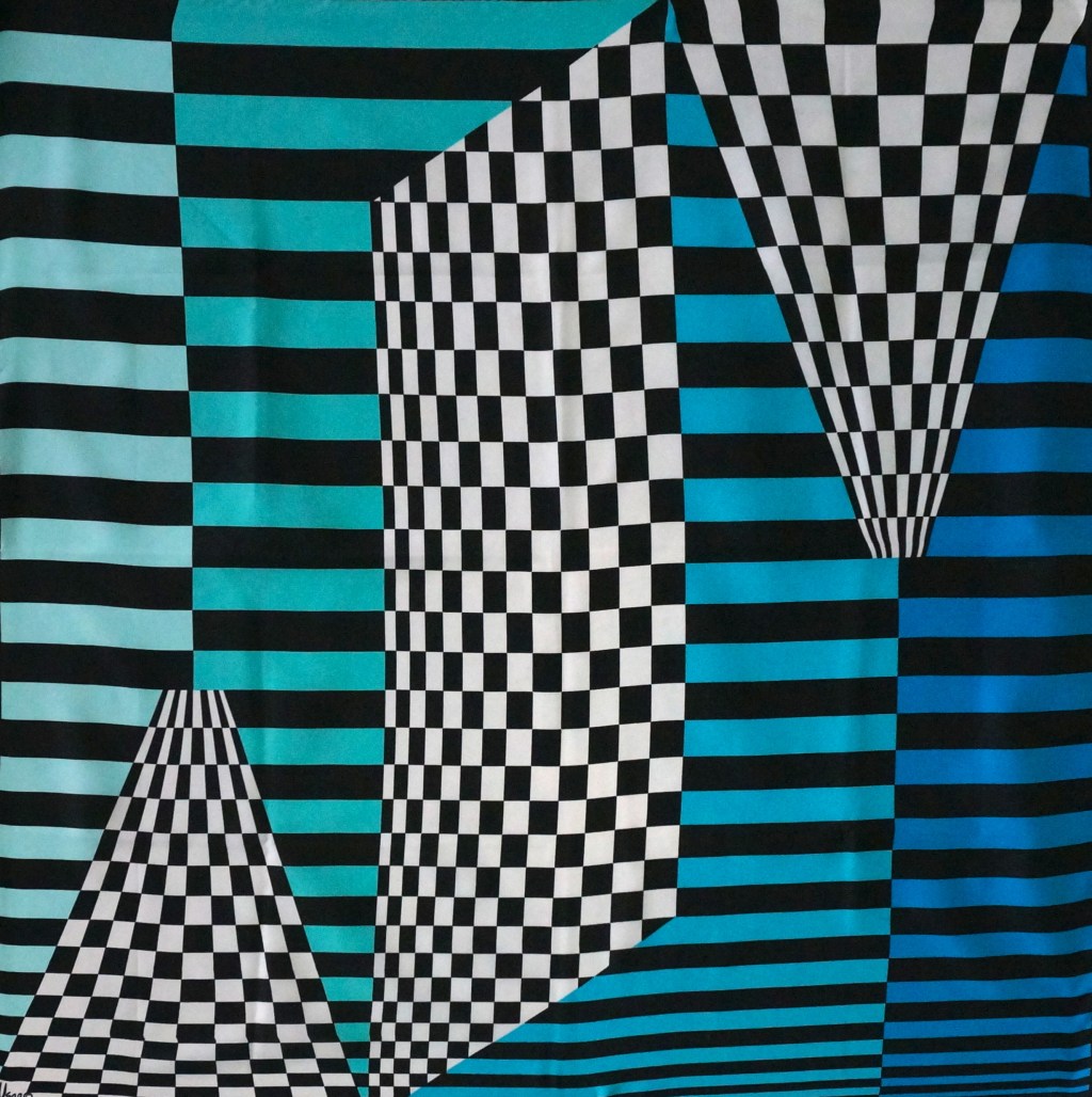
Vera Neumann’s artwork and scarves are largely identified with painted florals, butterflies and other natural motifs. However there is also a large group of geometrics in her work. I was surprised and thrilled when I spotted this scarf and purchased it not too long ago. I hadn’t ever seen a scarf like this by Vera, so obviously based on op art and its graphic formality. Based on research available on how to date a Vera scarf, I am guessing that this design was from the early 1960’s as it has the iconic Vera signature with a copyright symbol but not a ladybug which came a bit later.
I was intrigued by this design coming from Vera who focused on much looser designs and techniques. It reminded me of some patterns and scarves by Pucci (below). These scarves are dated 1968. The similarities are striking and I love their use of the black and white checkerboard pattern combined with vibrant colors.

These designs are of course all evocative of the work of Victor Vaserely, who has been called “the father of op art.” In his work he concentrated on the geometry of form coupled with endless color gradations, creating three dimensional work that is kinetic and vibrant.
Vasarely designed a visual alphabet based on basic geometric forms: the square, the circle and the triangle. He wrote about how each symbol could be depicted in any shade of color to form a “practically infinite number of possibilities”, the end results he called “Planetary Folklore” and the “Plastic Alphabet.”


In doing a bit of research on Vasarely I discovered that he produced some scarves of his op art designs in a limited run. These were signed and numbered by the artist and are now highly collectible. Pretty cool.

The two designs below seem eerily related. Vasarely painted the piece on the left in the 1960’s and the drawing on the right is by Pucci, dated 1980.


Vasarely had a “black and white” period from 1953-65 in which explored the negative/positive relationship of color and form. It seems he wanted to limit himself to black and white to explore the possibilities as well as the limitations of such a disciplined use of color. He certainly was not hindered by the lack of color during this period: the works are supremely three dimensional and feel so modern now.

Vasarely’s “Caopeo” reminds me a bit of the textile design below by Raoul Dufy which is from 1919. The Fauvist painter is less widely known for his textile designs, a career that began after being commissioned by couturier Paul Poiret to design textiles for his fashion collections.


One response to “Op Art Threads”
This is great stuff! I’m very impresed withyour research. Who know Vera did such graphic stuff. M
LikeLike